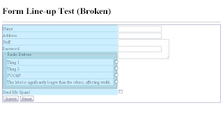
- Labels lined up in the same row as form fields
- Label column that stretches/shrinks to the size of the longest label
- As little extra HTML as possible
My solution was to nest the inputs I wanted to align inside a div, style the div so it would shrink to the width of its contents, and then use absolute positioning on the inputs (nested inside relative-positioned <label>s) to push them to the left by 100% of the width of the div.
If it sounds too easy, that's because it is. Here's what doesn't work:
- It only works with inputs that are the same height as the labels, which means it won't work with <textarea>s, multiple-row <select>s, and probably others I'm forgetting.
- Checkboxes and radio buttons inside the wrapper div can't be put before their labels because the positioning automatically puts the inputs on the right.
- Longer labels, such as you might need to ue for checkboxes and radio buttons, will stretch the wrapper <div>'s width.
- Those last two aren't problematic if you can group all your text inputs together and save everything else for the end. If you want to put anything between two groups of text inputs, though, you'll need two separate wrapper <div>s, which won't line up with each other.
I will post the code as soon as I can get it cleaned up and looking nice. (My test code is embarrassingly messy.) I also plan to revisit this project and see what fixes I can make. The checkbox problem at number 2 shouldn't be too hard to solve. Then again, that's what I said about CSS forms in general.


No comments:
New comments are not allowed.