Pages

Tuesday, September 20, 2011

Table-less Forms: A Partial Solition (Source Code)

In my last two posts, I discussed what I want to see in a table-free form and the problems I had with creating one. To recap, here's what I wanted:
  • Labels lined up in the same row as form fields
  • Label column that stretches/shrinks to the size of the longest label
  • As little extra HTML as possible
My solution was to enclose <label>s in a <div> that stretches/shrinks to the width of its contents, and to use absolute positioning to push the <input>s nested in those <label>s outside the <div>. The limitations of that solution are:
  • The <label>s' height won't stretch to fit form controls taller than a line of text, such as <textarea>.
  • Since <input>s are pushed to the right, you can't put checkboxes and radio buttons before their label text unless they're outside the wrapper <div>.
  • Long labels stretch the wrapper <div>.
  • Multiple wrapper <div>s in a form won't line up with each other.
So with that in mind, here's my source code. First the CSS:
form { /* Add border to form as visualization aid */
 border: 1px solid darkblue;
}
form * {
 clear: left; /* don't let floated .formlineup break layout. */
}
.formlineup {
 display: inline-block; /* shrink to fit content. */
 float: left; /* Needed for backward-compatibility with IE6 and FF2. */
 background-color: lightblue; /* Visualization aid */
}
.formlineup label {
 display: block;
 position: relative; /* allow absolute positioning of children */
 padding-top: 2px;
 margin-top: 2px;
 padding-right: .5em;
 background: #CEF; /* visualization aid */
}
.formlineup label input {
 position: absolute;
 top: 0px;
 left: 100%; /* Push all the way outside the <label> */
 height: 1em;
}
/* <br> tags are used in case CSS breaks.
They create extra space when CSS is working, so hide them. */
.formlineup br {
 display: none;
}

Next, the HTML. Note that nothing outside of div.formlineup is really important for this demo; I put the extra fields there to show some of the things that need to be outside of the wrapper div in order to work. See the screenshot in my previous post to see what happens when you put them inside.

<form>
<div class="formlineup">
 <label for="name">
  Name:
  <input type="text" name="name" id="name">
 </label><br>
 <label for="address">
  Address:
  <input type="text" name="address" id="address">
 </label><br>
 <label for="stuff" style="clear: left;">
  Stuff:
  <input type="text" name="stuff" id="stuff">
 </label><br>
 <label for="password">
  Password:
  <input type="password" name="password" id="password">
 </label>
</div>
<fieldset><legend>Radio Buttons</legend>
 <label for="thing1">
  <input type="radio" name="thing" value="1" id="thing1">
  Thing 1
 </label><br>
 <label for="thing2">
  <input type="radio" name="thing" value="2" id="thing2">
  Thing 2
 </label><br>
 <label for="voom">
  <input type="radio" name="thing" value="voom" id="voom">
  <em>VOOM!</em>
 </label><br>
 <label for="long">
  <input type="radio" name="thing" value="long" id="long">
  This label is longer than the others.
 </label><br>
</fieldset>
<label for="spam">
 <input type="checkbox" name="spam" id="spam">
 Send Me Spam!
</label><br>
<input type="submit"><input type="reset">
</form>

Addendum: Sorry about the ugliness of the source code; Blogger doesn't feature syntax highlighting out of the box, and there's some investment of effort required to add it. I'm still debating whether I want to add it or just stick to using my Wordpress blog to post source code from now on.

Wednesday, September 7, 2011

Table-less Forms: They Are Really That Hard.

A couple weeks ago, I posted a list of criteria for what I'd like to see in a CSS-based form that emulated the nifty features that tables provided. To recap, I wanted:
  • Labels lined up in the same row as form fields
  • Label column that stretches/shrinks to the size of the longest label
  • As little extra HTML as possible
The good news: I quickly came up with a solution that met all my criteria. The bad news: It only works with simple forms. ("I quickly came up with a solution" should have been a tip-off!) First, I'll explain what I did, and then I'll explain why it can't handle much complexity.
My solution was to nest the inputs I wanted to align inside a div, style the div so it would shrink to the width of its contents, and then use absolute positioning on the inputs (nested inside relative-positioned <label>s) to push them to the left by 100% of the width of the div.
Screen shot of form lineup test, working so far. Four text fields are aligned as expected. Radio and checkbox inputs outside the wrapper <div> are unaffected.
If it sounds too easy, that's because it is. Here's what doesn't work:
  1. It only works with inputs that are the same height as the labels, which means it won't work with <textarea>s, multiple-row <select>s, and probably others I'm forgetting.
  2. Checkboxes and radio buttons inside the wrapper div can't be put before their labels because the positioning automatically puts the inputs on the right.
  3. Longer labels, such as you might need to ue for checkboxes and radio buttons, will stretch the wrapper <div>'s width.
  4. Those last two aren't problematic if you can group all your text inputs together and save everything else for the end. If you want to put anything between two groups of text inputs, though, you'll need two separate wrapper <div>s, which won't line up with each other.
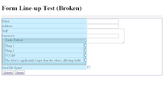
Screen shot of broken form lineup test. A <textarea> does is overlapped by the text field after it, checkboxes and radio buttons are in the wrong places, and the label column is stretched to fit the fieldset.


I will post the code as soon as I can get it cleaned up and looking nice. (My test code is embarrassingly messy.) I also plan to revisit this project and see what fixes I can make. The checkbox problem at number 2 shouldn't be too hard to solve. Then again, that's what I said about CSS forms in general.

Wednesday, August 24, 2011

Table-less Forms: Are They Really That Hard?

I probably don't need to explain the love-hate (and in many cases, just plain hate) relationship Web designers have with tables. If you don't believe me, a Google search turned up this lovely presentation on presentational tables that explains the issues in a much less hot-headed fashion than what I've typically seen before. What I usually read boils down to "Tables are evil, and you should never use them."

Naturally, this presents a few problems: Some things that are easy to do with tables and presentational HTML are much harder to do with CSS and purely semantic markup. For instance, the A List Apart article, Practical CSS Layout Tips, Tricks, & Techniques outlines a few of them and offers some solutions. There's just one thing that I have yet to see done to my satisfaction: Forms.

Every technique I've ever seen for table-less forms has the problem of sacrificing some of the functionality you get with a table. Sure, they can put labels and fields on the same row and even make sure the fields all line up together. However, most of them use either a fixed width or a percentage width for the label column. A table, on the other hand, will resize the columns to fit the content.

Worse still, some of the supposedly more semantic approaches introduce extra markup. The A List Apart article linked above gives us this mess:

<div style="width: 350px; background-color: #cc9;
border: 1px dotted #333; padding: 5px;
margin: 0px auto";>
  <form>
    <div class="row">
      <span class="label">Name:</span><span
class="formw"><input type="text" size="25" /></span>
    </div>
    <div class="row">
      <span class="label">Age:</span><span
class="formw"><input type="text" size="25" /></span>
    </div>
    <div class="row">
      <span class="label">Shoe size:</span><span
class="formw"><input type="text" size="25" /></span>
    </div>
    <div class="row">
      <span class="label">Comments:</span><span
class="formw">
        <textarea cols="25" rows="8">
        Go ahead - write something...
        </textarea>
      </span>
    </div>
  <div class="spacer">
  &nbsp;
  </div>
 </form>

</div>
Admittedly, that article is ten years old, which probably explains why it's a rather extreme example. But come now, <span class="label"> rather than just <label>? Inline styles? More importantly, <div class="row">? Isn't that awfully similar, structurally speaking, to a table? I thought part of the objective was to trim the fat from the code, and this doesn't have too many fewer tags than a table. To be fair, a more recent article from 2006 does a better job (though I'm not sure why the author chose an unordered list), but still doesn't solve the width problem.

Now some people will tell you that there's no problem with using tables to lay out forms. After all, they really are tabular: Labels get one column, form fields get another. The label refers to the form field on the same row. Besides, if you look at a real form, i.e. one made of ink and paper, it looks like a table. Besides, they're quick and simple to create, which is no small consideration when time is a factor.

I agree, to a point. I've certainly used tables to line up forms before, and I feel no remorse. Even so, it's not a perfect solution. For one thing, while you can make a case that forms are tabular enough to excuse the use of tables, that isn't really the most semantic way to do it. For another, you're still stuck with table markup and form markup.

What I really want is a method that will line everything up the way a table does, stretch or shrink the label column to fit the text, and minimize the extra HTML. To reiterate, I have never seen a solution that does this, though that may very well be because I haven't looked very hard. It seems like it shouldn't be too difficult to create such a solution.

So I think I will. Stay tuned.

Thursday, April 14, 2011

A Lot of Work for an MP3 Player

I recently obtained a shiny new laptop running Windows 7, and consequently windows Media Player 12, and I went to do some research on making my MP3 player, a Philips GoGear Jukebox HDD1835/37, work with the new software.

The first thing I found was a warning (using the <marquee> tag, no less) that Media Player 11 would cause problems, and recommending that users stick with version 10 "or the Software that your product came with."

Going a little further into the FAQ, I found a page about Vista containg this helpful nugget of information:

The Microsoft operating system usually comes with a set of software files which allow the operating system to recognize and control the functionality of portable device and those software files are known as native drivers. Windows Vista will also include native operating system support for some Philips products while others will require you to acquire software from Philips.

As software may not be available for some or all of the players, it is recommended to keep your existing Windows version and install Windows Vista in a dual boot configuration in order to retain the functionality of your player.

Let that sink in for a moment: Rather than take responsibility and release updated drivers, Philips is telling people to create a dual-boot system. Do you know how hard it is to create a dual-boot system? Maybe it's not a big deal for the more experienced, tech-savvy users, but for the average end user it's one of those things you just don't do on your own. You can easily ruin computers by messing with that stuff.

It's bad enough that Philips doesn't seem to care about legacy support. (To that effect, the FAQ for my player hasn't even been updated to say anything about Windows 7 or Media Player 12.) But I can't understand why Philips would tell people to make radical changes to their system rather than just trying to get them to buy a newer GoGear. What do you think?

Thursday, January 27, 2011

Okay. Google is cool. I admit it.

I used to swear I'd never drink the Google Kool-Aid. Now I'm swimming in it!

First I write a Google Maps-based script for the JB-Nets Web site. Then I start using Google Apps. Now I'm even playing with Google Custom Search Engine.

Just as a little test, I've punched in a few of my favorite Web design sites which you can search using the Google-provided box below:


Anyone know how to get Google stains out of white socks?

Monday, October 11, 2010

Blogging About My Blogger Blog

Hello, everybody! As you can see, I am now the proud owner of a Blogger Blog. As with my other recent experiment, a main reason for having this blog (and the reason for having more than one) is to experiment with different blogging services such as Blogger. So I think it's appropriate that my first post consist of my first impressions of this fine service.

First, the cons:
  • Blogger doesn't like <p>. Not only does its editor use line breaks (<br>s) instead of paragraphs, but it seems to strip out the <p>s I add manually in the HTML view.
  • The Dashboard interface takes some getting used to. It's not that bad, but it could use some improvement in both usability and aesthetics.
  • The Blogger header appears over every page. I've read that it's possible to turn that off, but I haven't yet played with the service enough to figure out how.
  • There are only about six templates available in the template designer.
  • Only 10 additional pages are allowed. I imagine that's plenty for most blogs, though.
And now the pros:
  • Templates are extremely customizable. Each template already includes several variations, page elements can be rearranged at will, and the template designer allows even further customization of colors, sizes, etc.
  • The template designer also allows custom style sheets (CSS), which is a pretty powerful tool. 
  • Custom HTML. Now that's customization! 
  • Custom templates can be uploaded. Just in case the custom CSS and HTML weren't enough.
  • The number of settings and options other than template customization is pretty impressive, too.
  • OpenID comments are supported.
Disclaimer: Though I've tried to avoid it, I'm sure I am guilty of mentally comparing and contrasting this fine service with WordPress.com. Once I've had more time to learn the ins and outs of each service, I'll try to write up a real comparison.