Pages

Wednesday, August 22, 2012

Is Nofollow Standard?

For some reason, I recently wondered if I should be annoyed that Web site owners are generally expected to include the non-standard rel="nofollow" attribute in links in their HTML. The problem with this thought is that calling the attribute “non-standard” is not particularly accurate. It depends on exactly what you mean by “non-standard.”

First, to be absolutely clear, adding rel="nofollow" to links is perfectly acceptable according to the HTML 4.01 standard. It passes the W3C’s validator. Frankly, though, I doubt that many people would lose sleep if it didn’t validate.

With that said, let me explain what I mean by “It depends.” When I first turned to the spec to fact-check myself, I came across the list of link types (which are the acceptable values for the rel attribute in a link), and “nofollow” isn't on it. The "nofollow" value does appear in the spec (Scroll to “Robots and the Meta Element”), but in the context of <meta name="robots" content="nofollow">, not the rel attribute. Besides, that section is “informative, not normative.”

On the other hand, there is nothing in the spec that prohibits Web developers from creating their own link types. (Whether it’s actually a good idea is another matter, which isn’t relevant here due to the widespread adoption of nofollow.) So anyone can use rel="nofollow". But there’s a catch. Here's what the section on link types has to say:
Authors may wish to define additional link types not described in this specification. If they do so, they should use a profile to cite the conventions used to define the link types. Please see the profile attribute of the HEAD element for more details.
I have to admit that this is the first I’ve even heard of the profile attribute. Is this just a case of my own ignorance? Well, yes, but then this isn’t the most common attribute. I didn’t see it on Wikipedia, even though Wikipedia uses nofollow. My Blogger blog doesn’t use it, either. (I also didn’t see it on a handful of other high-profile sites I checked, but to my surprise they didn’t use nofollow, either, so I won’t bother listing them.) I did notice it on my Wordpress blog, though. But not so fast: In that last case, the profile attribute points to http://gmpg.org/xfn/11, which does not list nofollow.
This isn’t necessarily a problem. The above quotation from the spec says that authors “should use a profile,” and in this context, “should” has a specific meaning. The spec says:
The key words "MUST", "MUST NOT", "REQUIRED", "SHALL", "SHALL NOT", "SHOULD", "SHOULD NOT", "RECOMMENDED", "MAY", and "OPTIONAL" in this document are to be interpreted as described in [RFC2119]. However, for readability, these words do not appear in all uppercase letters in this specification.
RFC 2119, in turn, has this to say:
3. SHOULD   This word, or the adjective "RECOMMENDED", mean that there
   may exist valid reasons in particular circumstances to ignore a
   particular item, but the full implications must be understood and
   carefully weighed before choosing a different course.
While I’m skeptical as to whether most site owners have actually “carefully weighed” the “full implications” of using nofollow without an accompanying profile, It’s not really that important in the scheme of things. The point is that there are “valid reasons” to use link types, and that means the spec clearly allows nofollow to be implemented in exactly the way I have observed.

All this is just a long-winded way of saying that nofollow is perfectly acceptable according to the standard, and only “non-standard” in the sense of not being explicitly included in the standard itself. The standard absolutely allows for it.

(It’s also in the W3C’s draft HTML5 spec and in WHATWG’s Living Standard, so if you’re the HTML5 type, rel="nofolow" is definitely standard. For now.)

The moral of the story, if there is one, is “Always check your facts before you complain about something.”

Thursday, May 24, 2012

Ultimate Blog Success Without Pollution?

I've recently gotten inspired to start blogging. I don't mean like back in October 2010, when I was inspired to sign up for Wordpress and Blogger accounts and play around with them. I mean I'm inspired to get serious about it. That doesn't mean I'm suddenly going to be able to crank out a few blog posts every day, or even a blog post every few days. But it does mean I'm going to try to stick to a schedule and have something to deliver on a more-or-less regular basis.

What set me on this path was a post I read on Jeff Atwood's blog, Coding Horror, called "How To Achieve Ultimate Blog Success In One Easy Step":
When people ask me for advice on blogging, I always respond with yet another form of the same advice: pick a schedule you can live with, and stick to it. Until you do that, none of the other advice I could give you will matter. I don't care if you suck at writing. I don't care if nobody reads your blog. I don't care if you have nothing interesting to say. If you can demonstrate a willingness to write, and a desire to keep continually improving your writing, you will eventually be successful.
This worked for him because:
Not every post was that great, but I invested a reasonable effort in each one. Every time I wrote, I got a little better at writing. Every time I wrote, I learned a little more about the topic, how to research topics effectively, where the best sources of information were. Every time I wrote, I was slightly more plugged in to the rich software development community all around me. Every time I wrote, I'd get a morsel of feedback or comments that I kept rolling up into future posts. Every time I wrote, I tried to write something just the tiniest bit better than I did last time.
Of course, Atwood's schedule was six posts per week, whereas mine is more like one or two per month. Still, I think the concept still applies: Practice and get better.

So far, so good, until I came across something in Jakob Nielsen's excellent Alertbox column: The "Information Pollution" article contains a bit of advice that seems to run counter to Atwood's:
Let's clean up our information environment. Are you saying something that benefits your customers, or simply spewing word count? If users don't need it, don't write it. Stop polluting now.
What does this mean? Should I follow Atwood's advice and keep posting, even if a given post isn't good, in the hopes of getting better? Or should I follow Nielsen's advice and not write something unless I feel it really needs to be written?

Now, let me qualify that a bit: I realize that since I'm writing a personal blog, I'm not exactly the target audience Nielsen had in mind. In fact, his follow-up on how to avoid information pollution focuses mostly on e-mail and is geared toward workplace behavior.

Even so, it's just as much a concern for me and my blog as it is for someone writing for a corporate Web site. After all, I don't want someone who finds this blog to have to comb through a bunch of useless posts to find something helpful or interesting. I definitely don't want to waste the time of people who find my blog in search results or pingback lists only to find out I'd barely touched on the topic they wanted.

For example, when I posted my piece on SOPA, a link to that post became a response under an article to which I posted a link.When I discovered this, it dawned on me that I hadn't really added anything to the conversation beyond "Look, I'm talking about this, too!" Readers who came via that link probably left with the impression that I have nothing to say, or at least nothing important.

The good news is that Nielsen's follow-up has good advice, and much of it is applicable to everyone, bloggers included. He summarizes it like this:
Better prioritization, fewer interruptions, and concentrated information that's easy to find and manage helps people become more productive and stop wasting their colleagues' time.
The three pieces of advice I think are most applicable to me are "set priorities," Write informative subject lines," and "Write short." I can handle that. Of course, as Atwood says, none of that advice matters if I don't start writing.

So here's my game plan:
  1. Commit to writing at least one blog post per month.
  2. Focus on the most important things I want to say, and be okay with letting some of the other things be less polished.
  3. Worry less about catchy or clever titles, and more about letting readers know what to expect from each post.
  4. Know when it's time to finish a post, instead of letting it get so overgrown that even if I ever finish writing it, no one will want to read it.
Wish me luck.

Tuesday, September 20, 2011

Table-less Forms: A Partial Solition (Source Code)

In my last two posts, I discussed what I want to see in a table-free form and the problems I had with creating one. To recap, here's what I wanted:
  • Labels lined up in the same row as form fields
  • Label column that stretches/shrinks to the size of the longest label
  • As little extra HTML as possible
My solution was to enclose <label>s in a <div> that stretches/shrinks to the width of its contents, and to use absolute positioning to push the <input>s nested in those <label>s outside the <div>. The limitations of that solution are:
  • The <label>s' height won't stretch to fit form controls taller than a line of text, such as <textarea>.
  • Since <input>s are pushed to the right, you can't put checkboxes and radio buttons before their label text unless they're outside the wrapper <div>.
  • Long labels stretch the wrapper <div>.
  • Multiple wrapper <div>s in a form won't line up with each other.
So with that in mind, here's my source code. First the CSS:
form { /* Add border to form as visualization aid */
 border: 1px solid darkblue;
}
form * {
 clear: left; /* don't let floated .formlineup break layout. */
}
.formlineup {
 display: inline-block; /* shrink to fit content. */
 float: left; /* Needed for backward-compatibility with IE6 and FF2. */
 background-color: lightblue; /* Visualization aid */
}
.formlineup label {
 display: block;
 position: relative; /* allow absolute positioning of children */
 padding-top: 2px;
 margin-top: 2px;
 padding-right: .5em;
 background: #CEF; /* visualization aid */
}
.formlineup label input {
 position: absolute;
 top: 0px;
 left: 100%; /* Push all the way outside the <label> */
 height: 1em;
}
/* <br> tags are used in case CSS breaks.
They create extra space when CSS is working, so hide them. */
.formlineup br {
 display: none;
}

Next, the HTML. Note that nothing outside of div.formlineup is really important for this demo; I put the extra fields there to show some of the things that need to be outside of the wrapper div in order to work. See the screenshot in my previous post to see what happens when you put them inside.

<form>
<div class="formlineup">
 <label for="name">
  Name:
  <input type="text" name="name" id="name">
 </label><br>
 <label for="address">
  Address:
  <input type="text" name="address" id="address">
 </label><br>
 <label for="stuff" style="clear: left;">
  Stuff:
  <input type="text" name="stuff" id="stuff">
 </label><br>
 <label for="password">
  Password:
  <input type="password" name="password" id="password">
 </label>
</div>
<fieldset><legend>Radio Buttons</legend>
 <label for="thing1">
  <input type="radio" name="thing" value="1" id="thing1">
  Thing 1
 </label><br>
 <label for="thing2">
  <input type="radio" name="thing" value="2" id="thing2">
  Thing 2
 </label><br>
 <label for="voom">
  <input type="radio" name="thing" value="voom" id="voom">
  <em>VOOM!</em>
 </label><br>
 <label for="long">
  <input type="radio" name="thing" value="long" id="long">
  This label is longer than the others.
 </label><br>
</fieldset>
<label for="spam">
 <input type="checkbox" name="spam" id="spam">
 Send Me Spam!
</label><br>
<input type="submit"><input type="reset">
</form>

Addendum: Sorry about the ugliness of the source code; Blogger doesn't feature syntax highlighting out of the box, and there's some investment of effort required to add it. I'm still debating whether I want to add it or just stick to using my Wordpress blog to post source code from now on.

Wednesday, September 7, 2011

Table-less Forms: They Are Really That Hard.

A couple weeks ago, I posted a list of criteria for what I'd like to see in a CSS-based form that emulated the nifty features that tables provided. To recap, I wanted:
  • Labels lined up in the same row as form fields
  • Label column that stretches/shrinks to the size of the longest label
  • As little extra HTML as possible
The good news: I quickly came up with a solution that met all my criteria. The bad news: It only works with simple forms. ("I quickly came up with a solution" should have been a tip-off!) First, I'll explain what I did, and then I'll explain why it can't handle much complexity.
My solution was to nest the inputs I wanted to align inside a div, style the div so it would shrink to the width of its contents, and then use absolute positioning on the inputs (nested inside relative-positioned <label>s) to push them to the left by 100% of the width of the div.
Screen shot of form lineup test, working so far. Four text fields are aligned as expected. Radio and checkbox inputs outside the wrapper <div> are unaffected.
If it sounds too easy, that's because it is. Here's what doesn't work:
  1. It only works with inputs that are the same height as the labels, which means it won't work with <textarea>s, multiple-row <select>s, and probably others I'm forgetting.
  2. Checkboxes and radio buttons inside the wrapper div can't be put before their labels because the positioning automatically puts the inputs on the right.
  3. Longer labels, such as you might need to ue for checkboxes and radio buttons, will stretch the wrapper <div>'s width.
  4. Those last two aren't problematic if you can group all your text inputs together and save everything else for the end. If you want to put anything between two groups of text inputs, though, you'll need two separate wrapper <div>s, which won't line up with each other.
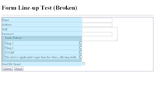
Screen shot of broken form lineup test. A <textarea> does is overlapped by the text field after it, checkboxes and radio buttons are in the wrong places, and the label column is stretched to fit the fieldset.


I will post the code as soon as I can get it cleaned up and looking nice. (My test code is embarrassingly messy.) I also plan to revisit this project and see what fixes I can make. The checkbox problem at number 2 shouldn't be too hard to solve. Then again, that's what I said about CSS forms in general.

Wednesday, August 24, 2011

Table-less Forms: Are They Really That Hard?

I probably don't need to explain the love-hate (and in many cases, just plain hate) relationship Web designers have with tables. If you don't believe me, a Google search turned up this lovely presentation on presentational tables that explains the issues in a much less hot-headed fashion than what I've typically seen before. What I usually read boils down to "Tables are evil, and you should never use them."

Naturally, this presents a few problems: Some things that are easy to do with tables and presentational HTML are much harder to do with CSS and purely semantic markup. For instance, the A List Apart article, Practical CSS Layout Tips, Tricks, & Techniques outlines a few of them and offers some solutions. There's just one thing that I have yet to see done to my satisfaction: Forms.

Every technique I've ever seen for table-less forms has the problem of sacrificing some of the functionality you get with a table. Sure, they can put labels and fields on the same row and even make sure the fields all line up together. However, most of them use either a fixed width or a percentage width for the label column. A table, on the other hand, will resize the columns to fit the content.

Worse still, some of the supposedly more semantic approaches introduce extra markup. The A List Apart article linked above gives us this mess:

<div style="width: 350px; background-color: #cc9;
border: 1px dotted #333; padding: 5px;
margin: 0px auto";>
  <form>
    <div class="row">
      <span class="label">Name:</span><span
class="formw"><input type="text" size="25" /></span>
    </div>
    <div class="row">
      <span class="label">Age:</span><span
class="formw"><input type="text" size="25" /></span>
    </div>
    <div class="row">
      <span class="label">Shoe size:</span><span
class="formw"><input type="text" size="25" /></span>
    </div>
    <div class="row">
      <span class="label">Comments:</span><span
class="formw">
        <textarea cols="25" rows="8">
        Go ahead - write something...
        </textarea>
      </span>
    </div>
  <div class="spacer">
  &nbsp;
  </div>
 </form>

</div>
Admittedly, that article is ten years old, which probably explains why it's a rather extreme example. But come now, <span class="label"> rather than just <label>? Inline styles? More importantly, <div class="row">? Isn't that awfully similar, structurally speaking, to a table? I thought part of the objective was to trim the fat from the code, and this doesn't have too many fewer tags than a table. To be fair, a more recent article from 2006 does a better job (though I'm not sure why the author chose an unordered list), but still doesn't solve the width problem.

Now some people will tell you that there's no problem with using tables to lay out forms. After all, they really are tabular: Labels get one column, form fields get another. The label refers to the form field on the same row. Besides, if you look at a real form, i.e. one made of ink and paper, it looks like a table. Besides, they're quick and simple to create, which is no small consideration when time is a factor.

I agree, to a point. I've certainly used tables to line up forms before, and I feel no remorse. Even so, it's not a perfect solution. For one thing, while you can make a case that forms are tabular enough to excuse the use of tables, that isn't really the most semantic way to do it. For another, you're still stuck with table markup and form markup.

What I really want is a method that will line everything up the way a table does, stretch or shrink the label column to fit the text, and minimize the extra HTML. To reiterate, I have never seen a solution that does this, though that may very well be because I haven't looked very hard. It seems like it shouldn't be too difficult to create such a solution.

So I think I will. Stay tuned.

Thursday, April 14, 2011

A Lot of Work for an MP3 Player

I recently obtained a shiny new laptop running Windows 7, and consequently windows Media Player 12, and I went to do some research on making my MP3 player, a Philips GoGear Jukebox HDD1835/37, work with the new software.

The first thing I found was a warning (using the <marquee> tag, no less) that Media Player 11 would cause problems, and recommending that users stick with version 10 "or the Software that your product came with."

Going a little further into the FAQ, I found a page about Vista containg this helpful nugget of information:

The Microsoft operating system usually comes with a set of software files which allow the operating system to recognize and control the functionality of portable device and those software files are known as native drivers. Windows Vista will also include native operating system support for some Philips products while others will require you to acquire software from Philips.

As software may not be available for some or all of the players, it is recommended to keep your existing Windows version and install Windows Vista in a dual boot configuration in order to retain the functionality of your player.

Let that sink in for a moment: Rather than take responsibility and release updated drivers, Philips is telling people to create a dual-boot system. Do you know how hard it is to create a dual-boot system? Maybe it's not a big deal for the more experienced, tech-savvy users, but for the average end user it's one of those things you just don't do on your own. You can easily ruin computers by messing with that stuff.

It's bad enough that Philips doesn't seem to care about legacy support. (To that effect, the FAQ for my player hasn't even been updated to say anything about Windows 7 or Media Player 12.) But I can't understand why Philips would tell people to make radical changes to their system rather than just trying to get them to buy a newer GoGear. What do you think?

Thursday, January 27, 2011

Okay. Google is cool. I admit it.

I used to swear I'd never drink the Google Kool-Aid. Now I'm swimming in it!

First I write a Google Maps-based script for the JB-Nets Web site. Then I start using Google Apps. Now I'm even playing with Google Custom Search Engine.

Just as a little test, I've punched in a few of my favorite Web design sites which you can search using the Google-provided box below:


Anyone know how to get Google stains out of white socks?